About our logo
The logo for this site was pretty much an afterthought—in our lengthy planning stages both Kent and I, as historians (and not terribly graphics-savvy guys!), were pretty much monocularly-focused on content and presentation.
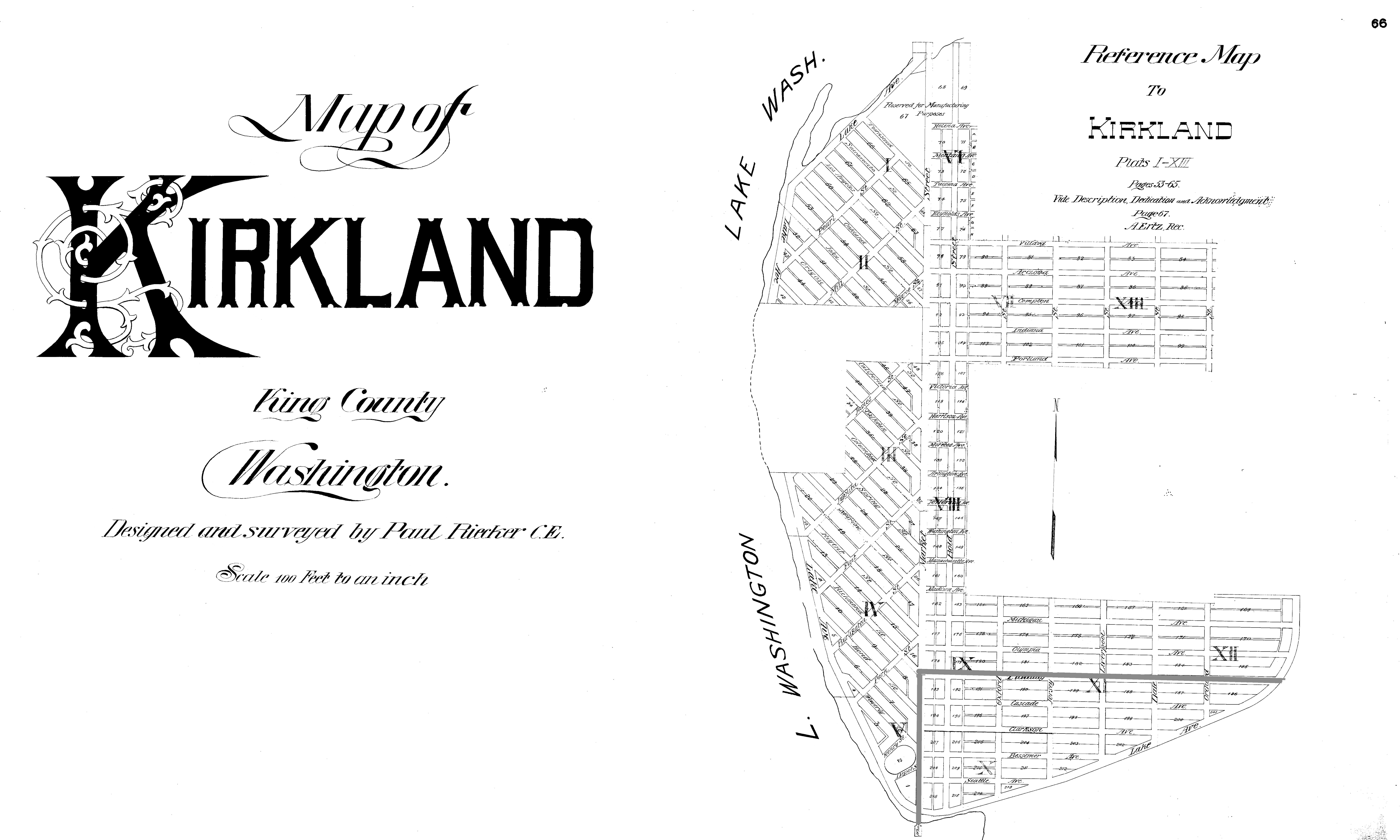
As we got closer to making the site live, we decided to get some expert help, so we brought in talented young graphic artist Nicole Allias, with whom I had worked in the past on several business and history-related projects. Nicole chatted with us a bit about the site and its purpose. We realized that we wanted to stay in the historic vein, so we decided to borrow from the very creation of Kirkland: The 1890 townsite plat.

A small, hastily drafted, almost crude, original plat was created by the Kirkland Land & Improvement Company in 1888, but because of substantial changes in plans as to where the rail line and steel mill were to be located, it had to be replaced in 1890; this time with a much more robust and detailed 15-page plat, designed and drawn for the company by Paul Reicher, and signed by the company president, Peter Kirk, and Walter Williams, the company secretary.

Nicole went to work, first in establishing that the original typeface was no longer available and had been lost to the sands of time, then in recreating it in facsimile to create the final logo. We were delighted with the final product and offer our big thanks to Nicole for bringing that to life!
